


Results 1 to 15 of 16
-
05-10-2010, 04:24 PM #1RXMUSCLE TEAM


- Join Date
- Mar 2009
- Location
- Philadelphia
- Posts
- 1,594
- Rep Power
- 107863
 Important question for all fans and bodybuilders.
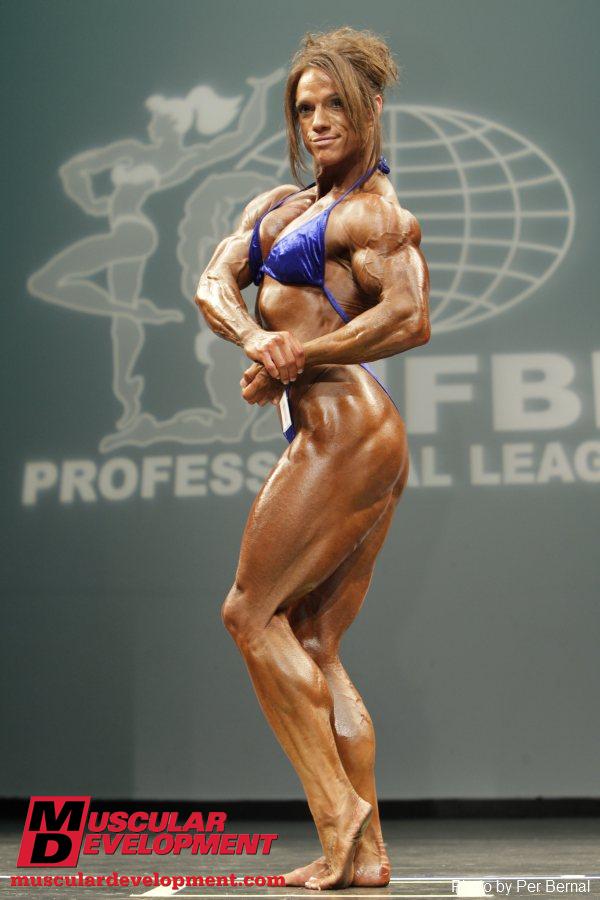
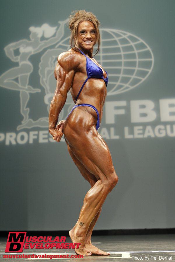
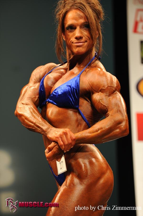

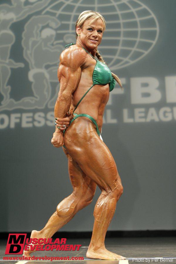
Photographs courtesy of MD.com - Per Bernal, Rx Muscle.com - Chris Zimmerman, FLEXonline.com - Bill Comstock.
 Originally Posted by Ibarramedia

I have been extremely lucky to be with the RX Team since the beginning. Going from an unknown to an...uh, still er kinda unknown lol. But in the short time I have been doing photography things have REALLY picked up for me. At first I jumped at the chance to shoot anyone for free to get some exposure. Now finally I asked frequently to shoot with various top athletes but most importantly they allow me to direct and do the pictures as I see fit...
Since day one I have been trying to improve my techniques and learn all that I can. I'm very satisfied with my own work which leads me to this question...
Every photographer has their preference when it comes to picture styles, composition, exposures, depth of field etc. BUT when all is said and done the stage shots are for YOU, THE FANS! I cant get creative or tell the competitors how to pose.
I would like some feed back as far as exposure and white balance (warmth, or color balance) of the pics are concerned. I do many shows each year and want to do the best I can. I understand pictures are subjective but would like to know YOUR thoughts, so I can do a better job.
I attached a post from IBAR on the NY Pro thread, which contained samples from various photographers. We all do things a little different. I like to make the competitors slightly 'pop'. I also seemed to go for a slightly darker exposure (which I prefer but others may hate. This is why I ask.) For example, I def nailed the color of the ladies suits to match what they wore on stage...but you can tell by the highlights on my shots they were a bit warmer. I actually like the highlights on Bill's pics, which you can tell were a bit cooler, by the more blueish tone.
I will be doing many more shots from the small local shows to the bigger pro shows. Pictures of the competitors to me, are priceless moments in time that cant be reproduced. I want to please everyone, I know this is an impossibility...but it is my goal.
Thanks for your time, and hope to see you soon!
-
05-10-2010, 04:30 PM #2Banned
- Join Date
- Feb 2009
- Location
- queens, new york
- Posts
- 10,156
- Rep Power
- 0
dont you see more muscle 'pop' with cooler pics even though warmer pics look better with the tanning?
im sure the lighting matters a lot with the reflection off the skin on pics.
-
05-10-2010, 04:30 PM #3RX MEMBER
- Join Date
- Feb 2009
- Posts
- 11,832
- Rep Power
- 2146989
So are any of these photos yours? Am not sure what you want us to critique.
-
05-10-2010, 04:31 PM #4GYM RAT
- Join Date
- Jul 2009
- Location
- Pittsburgh, PA
- Posts
- 283
- Rep Power
- 10045
Personally I like yours how they are. I think the other two wash the competitor out more.
-
05-10-2010, 04:39 PM #5RXMUSCLE TEAM
- Join Date
- Mar 2009
- Location
- Philadelphia
- Posts
- 1,594
- Rep Power
- 107863
Originally Posted by hifrommike65
Yes mine are the RX pics by Chris Zimmerman < me lol
The exposure (brightness) and colors.
TPT, yeah it's tough cause we cant adjust the stage lighting at all. I even go through and make adjustments for competitors that are too pale. As for 'pop' yeah ya really cant see anything in pics from NY cept for the color of the suits.
I find if I go too dark it gives the competitors raccoon eyes ( I think their body looks more conditioned sometimes...but faces horrible lol)
-
05-10-2010, 05:59 PM #6RX MEMBER
- Join Date
- Mar 2009
- Location
- MT
- Posts
- 376
- Rep Power
- 13308
You do loose a bit of eyes and slight detail loss in the shadows when going for accurate color.
Do you have any examples that are in between the cooler pics from Bill and Per that give more white highlights and your warmer photos that are more color-accurate so we can see the middle ground? That may be the key spot where you do not loose detail, and eyes, while still getting near-accurate color. Just thinking out loud.
-
05-10-2010, 07:52 PM #7OLYMPIAN
- Join Date
- Mar 2009
- Location
- Maryland & Virginia
- Posts
- 12,387
- Rep Power
- 2148080
I'm no expert photographer and this is real basic. I've seen pics and I've posted them, probably paparazzi stuff and since I don't remember who or what because of the volume i've seen and posted i'll just say that generally before posting the pics fix the RED EYE from the competitors eyes. You can do that on your laptop. Vista and Windows 7 are equipped by default. Some of the older version may also have that. And again, My comment is not directed to one phog in particular but to everyone.
"Don't make me angry. You wouldn't like me when I'm angry" -Dr. David Banner
Despite everything, I believe that people are really good at heart - Anne Frank
-
05-10-2010, 08:10 PM #8RX MEMBER
- Join Date
- Feb 2009
- Posts
- 1,632
- Rep Power
- 119695
I never really thought about it, but I actually happen to like your shots the best. The other two just seem kinda "dull" in contrast.
-
05-10-2010, 08:43 PM #9RX MEMBER
- Join Date
- May 2009
- Location
- an undisclosed secure location
- Posts
- 434
- Rep Power
- 30672
Chris I prefer your style from those you've included above. The richer color gives more depth to the image. The others become pale and washed out. I don't know it photographers use this trick, but artists often view their subject matter through squinted eyes. Doing so helps you see the contrast (or depth) easier. If you try it with your images above you can see how the values really "pop". When you view the other images this way, the images become much more one dimensional.
The "raccoon eyes" can be dealt with using photoshop for a little modern "airbrushing".
-
05-10-2010, 08:56 PM #10TEAM CUTLER, Chem Forum Leader
- Join Date
- Feb 2009
- Location
- VEGAS
- Posts
- 12,575
- Rep Power
- 2148088
Chris, I don't know shit about photography, but I like the added color in your pics.
They seem more "alive".CutlerAthletics.com
CutlerNutrition.com
-
05-11-2010, 04:18 AM #11RX MEMBER
- Join Date
- Feb 2009
- Location
- Timbucktoo
- Posts
- 1,434
- Rep Power
- 320942
Per Bernals photos seem a little 'washed out' in terms of colour....probably just due to the model camera he's using? Comstock looks to have used 2 different cameras? One pic looks a little dull (in colour) and the other looks good. The colours in Zimmermans pics look vivid, which is good.
Apart from that I see no difference (but I am no photographer!)
-
05-11-2010, 04:50 AM #12OLYMPIAN
- Join Date
- Feb 2009
- Posts
- 16,860
- Rep Power
- 2148230
Pics look great nice work!
-
05-11-2010, 05:03 AM #13OLYMPIAN
- Join Date
- Feb 2009
- Location
- Chandler Arizona
- Posts
- 871
- Rep Power
- 1001722
nothing to do with the color or brightness etc but i cant stand looking at pictures of competitors that are so freaking close up you cant see any detail. Zoom out a little to get the "bigger picture" of someones physique.
People often say you need to step back to admire a nice painting, well the same goes with a persons physique, stand next to them and you cant see all the detail, as contradticting as that may seem..... its true.
Same applies to a picture of someone up close, its just becomes a blur, no close up shots, they do nothing for anyone.
-
05-11-2010, 04:57 PM #14RX MEMBER
- Join Date
- Mar 2009
- Location
- Sacramento, CA
- Posts
- 946
- Rep Power
- 34252
Of the tiny sample set available, Per wins.
Your Sheila shots aren't bad, but the cooler shots are better.
I love the blue-green background in that venue.
-
05-11-2010, 05:40 PM #15GYM RAT
- Join Date
- Aug 2009
- Posts
- 229
- Rep Power
- 8771
I like the darker tint. To me it's just as good as black and white.
Keep doing what you do Chris, you're good at it


 Reply With Quote


Bookmarks